Ottawa recently slipped below Moscow as the world’s coldest capital city for a day. But its support of women-owned businesses always warms our hearts. This week, rel8ed.to researcher Zach Dai dives into business cluster trends with a Tableau Modeling Approach using rel8ed.to’s VizArt student Competition Data
Tableau is known by its powerful visualization power, but today I want to share a hidden function in it: clustering! Along the way, I discovered that by using our data, we could find geographic hot and cold spots within Canada for women-owned businesses.
I am a recent graduate from the Goodman Business School MBA, Business Analytics program. I am currently working on a grant project at rel8ed.to as a Data Analyst. Here, I found everyone likes using visualization to explain the data in seeking creative solutions. Tableau is one of the most common tools at rel8ed.to, as it is simple, fast and powerful. Even me, an enthusiastic python programmer, has been completely changed in this environment. Using Tableau as the “first contact” with the data makes everything easier.
You don’t need any coding! Just by using Tableau functionality alone, you can create unsupervised cluster algorithms (today’s blog). You can also use some coding within Tableau to create a model (next week’s blog).
I will use rel8ed.to’s data from the 2019 Data VizArt Student Competition as the example. The data includes business information in different FSAs (1st 3 digits of the postal code) across major markets in Canada.
Clustering
Clustering is a very common unsupervised modeling approach. It can divide the data into small groups by mathematical distances (rather than human knowledge). As the groups are generated without human interruption, clustering can show us some hidden patterns within the data. When evaluating the rel8ed.to contest data, we saw opportunities to cluster because the relationship among the three attributes are different, which means the data can be divided into independent groups with special meanings. Below, we detail how to create a cluster model in Tableau and explore what information can extract from, and what would be possible applications based on the findings.
Data review
Our data subset contains 5 columns (FSA, Number of Businesses, Percentage of Businesses Less than 2 Years Old, Percentage of Businesses with Women Directors, and Average Age of Businesses).
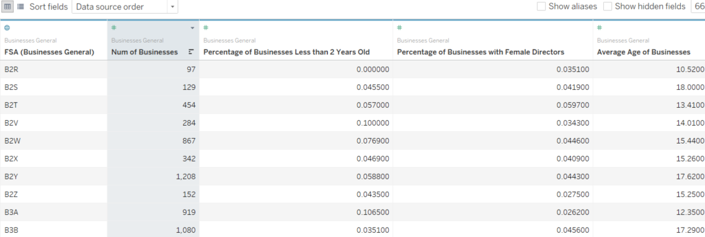
Using Tableau, we find that the percentage of Businesses less than 2 years old is correlated with Average Age of Business. We can only pick one of those two variables for the modeling, so we chose Average Age of Business. FSA is the id key, it cannot be used for modeling input. So, three attributes can be used (Number of Businesses, Percentage of Businesses with Women Directors, and Average Age of Businesses) to create the model.
Presenting 3-dimensional data
Usually we present data on 2 axes, however this can only tell you relationships between two attributes. We can use the third attribute as color or shape to present 3-dimension data (see more at another tutorial here). But color is not always the best way to present numeric correlation. So, we use another way – show all the relationships by each two from the 3 attributes. (Number of Businesses/ Women Directors, Number of Businesses/ Average Age, and Average Age/ Women Directors). By doing so, you can find any correlation among the three attributes.
Create a scatter plot by using the “shape graph”, with the attributes we selected. Do this by putting all three of the attributes in both the columns and the rows, and use the opposite order to list them, in the “Analysis” panel find “Aggregate Measure”, unselect it.
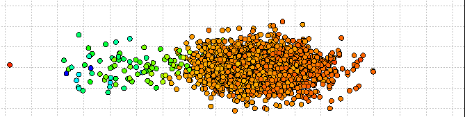
We will get 9 plots, each plot presents one correlation between two attributes. And we can see that average age and percentage of Women Directors has a strong correlation. Now we can start the clustering process.
Creating the Cluster Model
You can find a panel named “Analytics” hiding on the right of the “Data” panel. In the Analytics panel, there is a tool called “Cluster”, drag it to the graph area, and choose the Number of Clusters you want, then your clustering model is created.
I have created the YouTube video embedded below which shows the sequence of data review, then presenting the data, then creating the model, and then showing the clustered output.
Insight into the clusters
For simplicity, I just use the data as it is; keeping the outliers with a high number of business records. We can see, the four clusters are clearly separated in the Age/Gender Space. Cluster 1: Starters’ Area (with low average AGE and the least women directors); Cluster 2: Mature company center (high business age, average % of women directors); Cluster 3 Women’s region (The most women directors and more mature companies); Cluster 4 Growing Area (average & women directors, average company ages). We can also find the descriptive metrics by right clicking the “Clusters” option on the Marks panel, choose “describe cluster” a statistic report is generated. (Please note that this is only one example for clusters, you can use other numbers of clusters or choose other attributes.)
Use the clusters
Next, we can try to find the factors that generate this result. Move out all the variables from the Rows and Columns area of Tableau. Transform the FSA into “Geographic Role: ZIP Code/postal Code” by dragging the Longitude to Columns and the Latitude to Rows. A map graph is generated. Change the Marks to “Circle”, now we can see the distribution of the clusters in different areas.
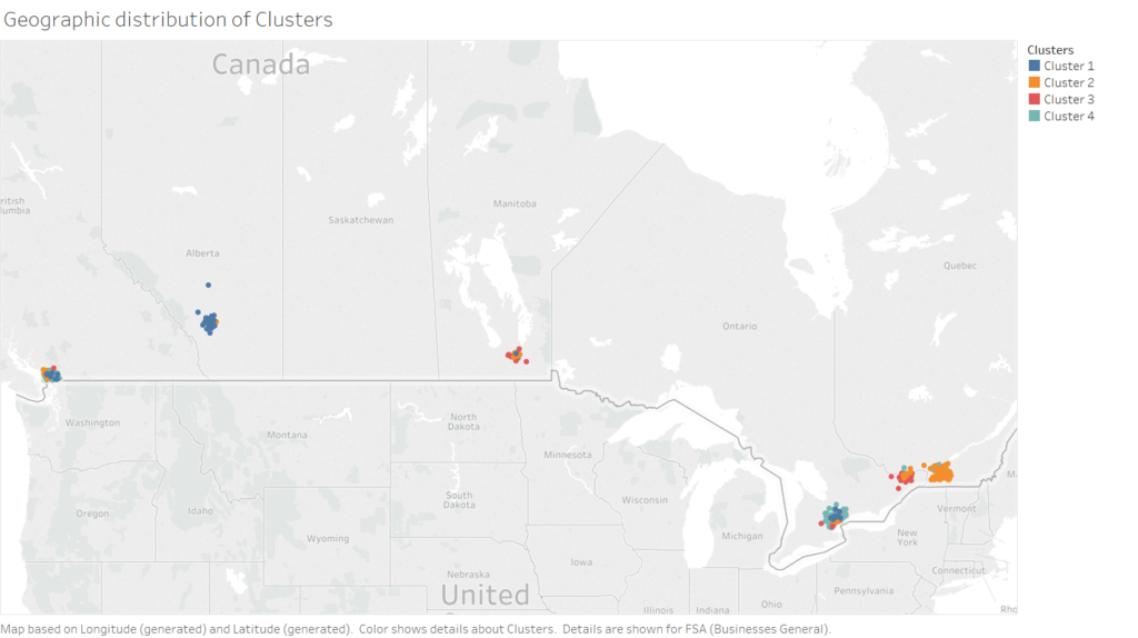
From the map above, it is easy to observe the following patterns: 1. The high women director percentage areas (Cluster 3) are in Ottawa and Winnipeg, the highest in Ottawa. 2. Montreal and Ottawa have more Mature Company centers (Cluster 2); 3. Growing companies are highly centralized in the Toronto Area; 4. Calgary has the largest number of startup companies, followed by Vancouver and Toronto.
We can see the type of FSA areas changes from the west to the east, the average business age increases when traveling from the west to the east. The central provinces have higher women director rates.
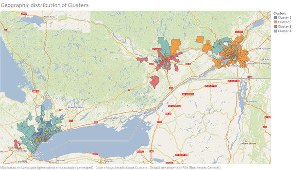
We are also interested in the patterns of the cities (such as Toronto, Ottawa, and Montreal). Zoom out the map, change the display from “circle” to “map” in the Marks panel (see visual below). We can have a closer look at these cities. To make the map look better, we can add a Web Map Service (WMS); perhaps a subscription based one or an open data one; for example Terrestris. Now we can see the differences among the three cities. Montreal is definitely a mature companies center. Remember in this cluster there is limited women director/ownership. Its neighbor Ottawa also has similar business ages, the difference is possibly that as the capital of Canada, more women take director/owner positions in companies here to align with government contracting guidelines. Clusters in Toronto show a strong difference from these two cities, as it has the most businesses of medium age. In the north of Toronto, there is some new business development seen. Older companies are mainly located at the “downtown” area as one might expect.
Cluster Conclusions
Tableau is a powerful tool, not only for regular visualization but also for quick modeling. With the help of the clustering functions, we can easily explore our data and gather insights. To improve the results, we could try to generate clusters with different attributes, or make different numbers of clusters. Combining with other visualization graphs, we can find the hidden information from the data.
When looking at the six largest Canadian metro areas, Ottawa outpaced the other five for women owned business clusters. This would suggest that conditions are most favourable for women in Ottawa. Montreal, on the other hand, appears to be the least appealing to women-owned business in this dataset.
In our next installment, we will apply some R scripts in Tableau to aid in decision tree modeling.
Categorised in: Business Data Analysis, Data Visualization, Predictive Analytics, Tableau
This post was written by Zack Dai